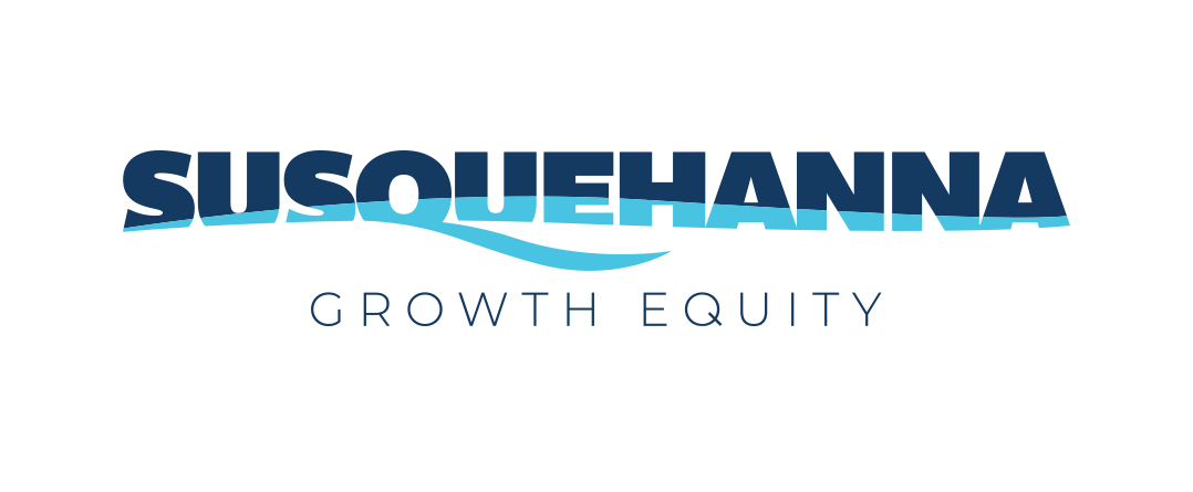
Spitball’s solution was to leverage the existing design elements but modernize the logo. The old 3 river waves were converted to a more organic wave and color treatment in the core typography, as well as a highlight in the Q. The result was a clean, modern logo design that better reflected the company, personality and management style.
Susquehanna Growth Equity
Corporate Branding, Website Design, Collateral
Susquehanna Growth Equity has a different approach than most venture capitalist firms. They have a patient-capital, entrepreneur focused philosophy that is in stark contrast to the typical controlling nature of most VC firms. They tasked Spitball with developing a new brand identity, visual platform and messaging to capture their unique positioning.
One of the biggest issues Susquehanna Growth Equity was what they called themselves. They were inconsistent and their logo showed it. Sometimes they called themselves by their full name and others by their acronym – which seemed natural given how long their name was. But when it came to their logo, it needed focus and needed a refresh. During our brand discovery and research, Spitball recommended using their full name because it provided more clarity in who they were versus a generic acronym. This allowed us to develop a logo that eliminated unnecessary elements from the brand identity.


Website Design
The old Susquehanna website was fairly standard but it did not capture the down-to-earth brand personality that it needed to evoke. Inspired by not only the brand personality but the many personalities within Susquehanna, Spitball created a dynamic website design that leveraged parallax animations to add life to the page. A color wash treatment helped soften the imagery to reinforce the natural effect of the website.
Collateral
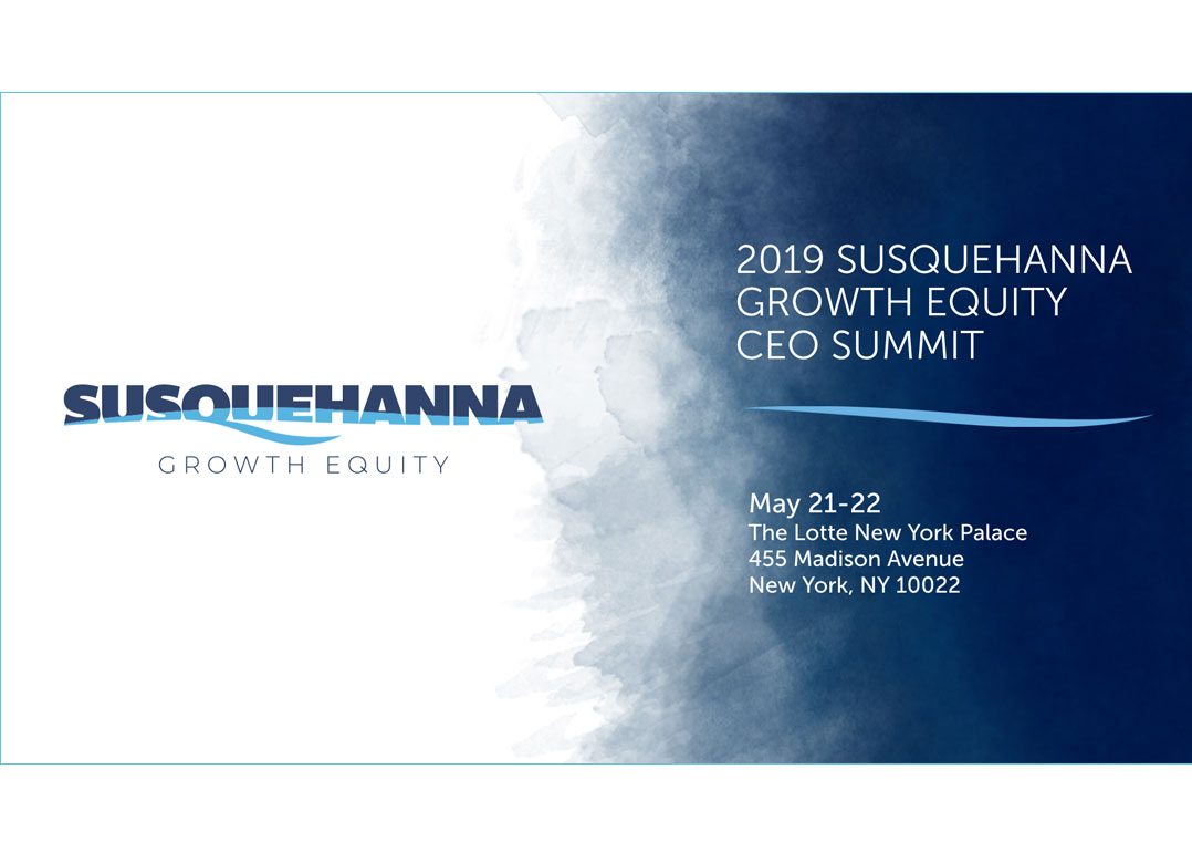
The design of the logo and website were carried out to other company materials including brochures and presentations to help create a consistent look and feel throughout the brand.


