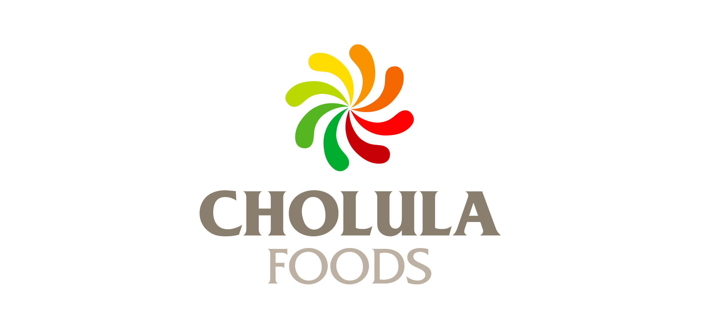
With plans to expand into various product categories, the new Cholula Foods logo needed to pay homage to the hot sauce that gave birth to the company. It also needed to be universal and flexible to represent a wide range of products in the future.
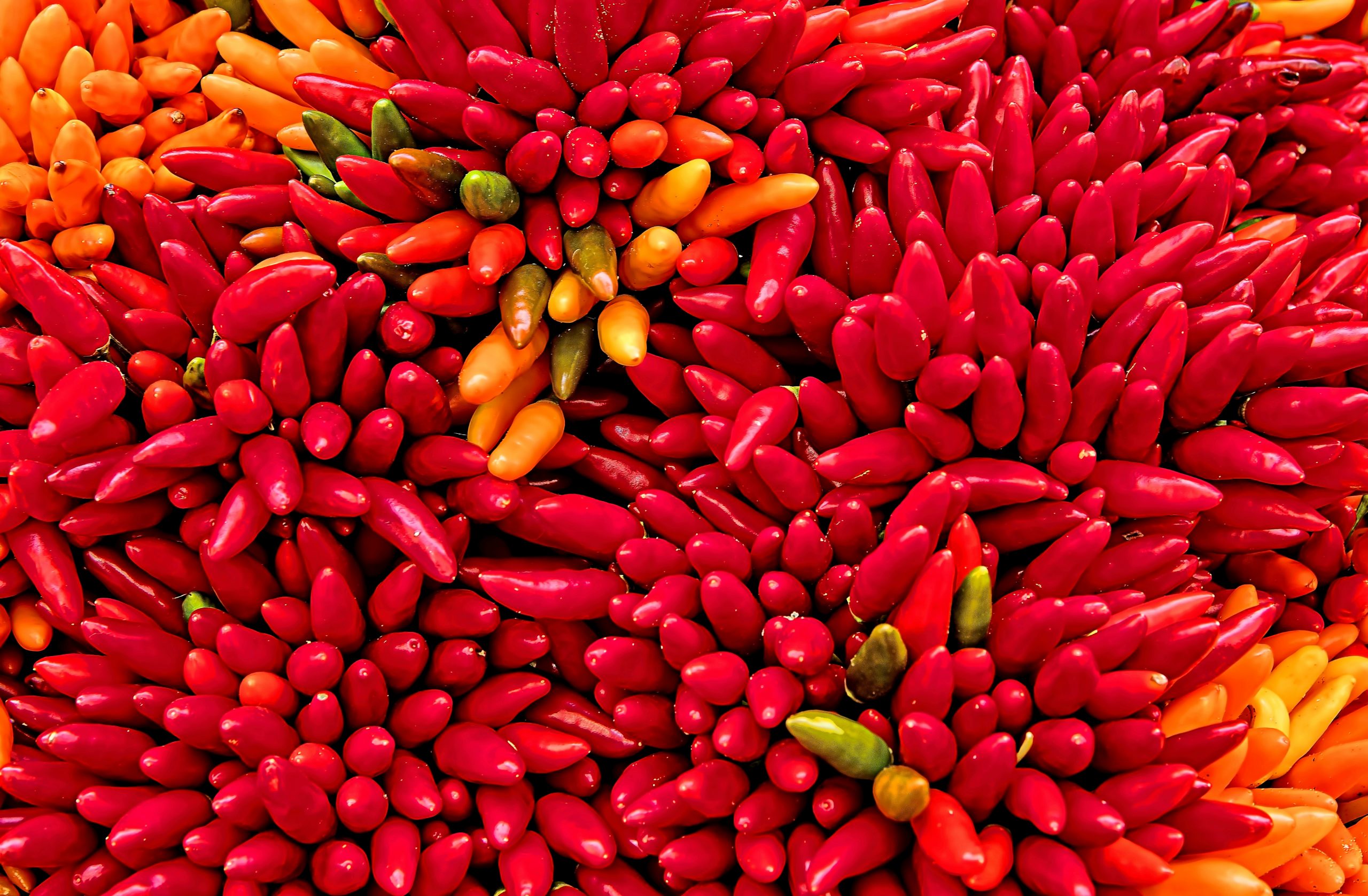
The inspiration behind the logo was Cholula’s unique peppers. Spitball used a spiral progression of aging peppers as the key graphic and incorporated the brand’s typography. A full color logo was the primary mark, however one-color and two-color versions were created for various print uses.

