The following was written by Spitball’s wonderful and talented Lucy Dineen, guest writer, marketing intern, and french toast stick lover.
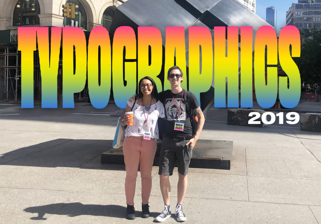
The art of assembling and constructing letters to convey written language in an engaging, legible way has been around since the birth of advertising (bet the Phonecians didn’t see this one coming). Brands depend on effective typography to illustrate their unique personalities to consumers through logos and campaigns. In an ever-evolving world of marketing technology, Spitball knows that it is important for designers to continually learn about trends in typography. And so, Spitball designers Nick and Nadin packed up their straws and headed over to the Typographics Conference 2019 at Cooper Union on the quest to figure out their type. I sat down with Nadin and Nick to help put their experience into words.
What were the two searching for exactly? Inspiration, for one. Nick wanted to discover innovations in type and design. Nadin wondered if there were new and exciting ways to allow typography to speak for a brand. As if they read both of their minds, featured speakers Zipeng Zhu, Elle Kim, and Joyce N Ho encouraged Nick and Nadin to consider the marriage of motion and bold type from a completely different perspective.
One way to find inspiration for motion (and many other genres of) design is by immersing oneself in new environments. Is this a sign to book that cruise to the Bahamas you’ve been drooling over? Maybe. But Nick and Nadin discovered that inspiration can be surprisingly close to home. For example, Joyce Ho inspired our designers with her animated typography inspired by the dynamic lighting of a lunar eclipse.
Upon reflection, (lunar eclipse pun totally intended) it’s easy to realize that animation and type have been incorporated into logo design for years. Think about the rambunctious lamp jumping on the Pixar logo before each movie. You and I both know we could reenact his one-legged hop in a game of charades. Animation and motion sets a brand apart, gives it personality, and consequently, brings it to life.
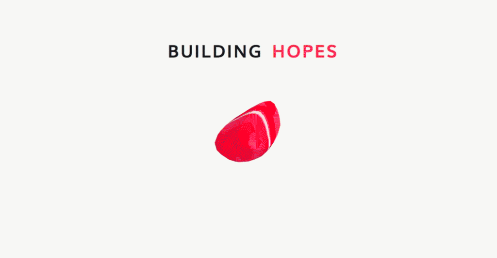
As we step further into the realm of inspiration, data visualization appears to be revolutionized within the realm of typography. Typography is spoken language brought to life, but what if we could push our communication even further? Georgia Lupi inspired Nick and Nadin to perceive data as a way to communicate in a different language as well as a way to create visualizations that speak volumes. Lupi humanizes numbers and information by weaving them into a meaningful work of art; forcing the data to become engaging to the flitty modern audience. The two also admired her efforts to push data into a 3-D world using AR. Establishing a platform for consumers to interact with data, such as Lupi’s Google Building Hopes App, opens up a future for designers to give meaning to data in a more dynamic and engaging way.
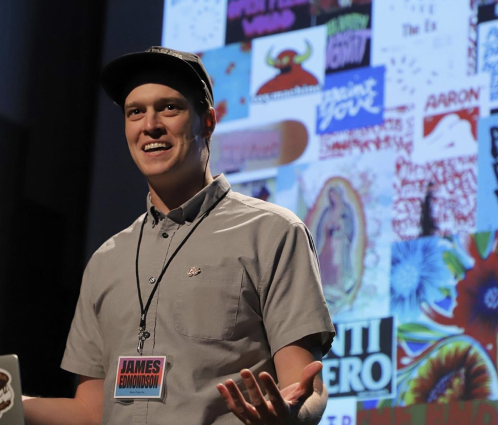
On the more serendipitous side of their conference-going, Nick and Nadin dove headfirst into the greatest debate aside from the proposal that hot dogs are in fact sandwiches. What is modernism in typography? A myriad of companies have translated the idea as a swift push towards overused, homogenous logo design. Speaker James Edmondson brought light to this in a tweet comparing rebranded Silicon Valley company logos to their more unique origins.
The Spitballers began to question why companies are so perturbed by playfulness in their branding journey. Sure, choosing from a small group of expected fonts creates a sense of consistency and professionalism. However, the unique personalities of corporations have begun to dissipate into a hazy Gotham and Helvetica fog. This isn’t minimalism’s fault. It is perfectly fine to choose a functional, clean typeface if it suits the image of a company. However, beauty is in the diversity that discretion provides. Overall, the designers were encouraged to question the definition of modern typography and continue to fight for creative and unexpected choices while building a brand.
“Trust the process,” is a slogan that rings true in both Spitball and one of our favorite sports here, basketball. Only we have concepts to score with, not baskets. Listening to the way typographers implement their unique process when dealing with text provides an opportunity for creative growth in systematic thinking. Nick hoped that during his time at the conference, the speakers would expose the team to their creative processes and inspire improvements to Spitball’s design approach.
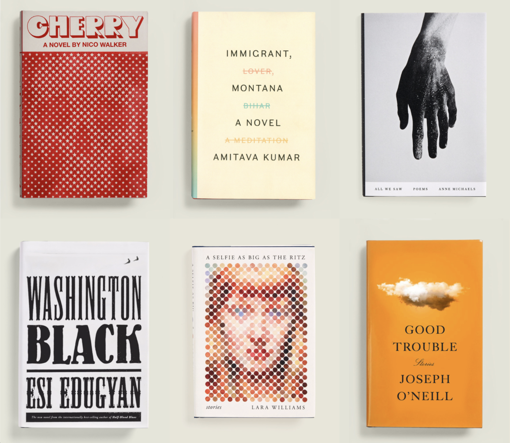
Another example of thinking differently with type was shared by Janet Hansen through her book cover work. She began her speech by divulging the meticulous steps taken in creating the typography for her simple, yet telling, book cover designs. Hansen begins by researching old books to create interesting graphics and typefaces. During her creative process, she finds unconventional ways to explore possibilities within the alphabet, always allowing letters to be the star of the show by establishing one key visual. When it comes time to present her concepts, she opts to display only a few to the client. This makes it easier for the client to focus and trust in the confidence of the designer. The Spitballers agreed that this is a great practice to be used in the client/designer dynamic.
It is safe to say that more than a few ideas stuck to Nadin and Nick during their time at the Typographics 2019 conference. From learning about emerging technology such as variable fonts, to using gender-neutral bathrooms for the very first time, the Spitball design team expanded their perception of what’s possible. They realized that all of the world is trying to grasp what modernism should be and how it fits in the design universe. We should not be afraid to be playful with text and incorporate motion when building a brand. Minimalism can be an answer but isn’t the only answer. Get inspired by the magnets on your fridge, the stars in the sky, a cruise to the Bahamas… Find inspiration anywhere and everywhere.
Where will your type take you?


